
Plot symptom selection against the chance baseline
Source:R/plot_symptom_selection.R
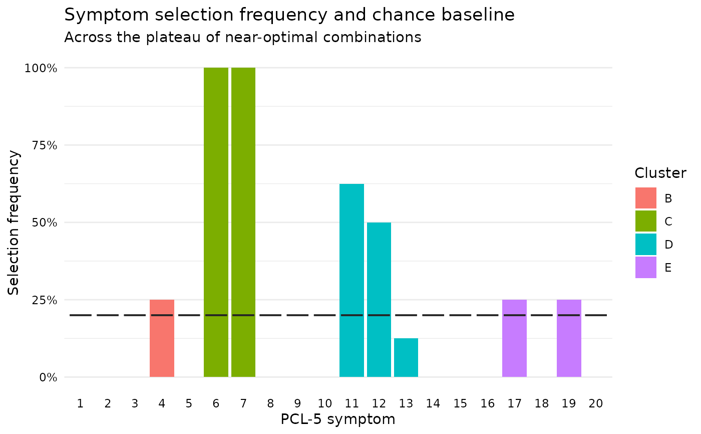
plot_symptom_selection.RdDraws the per-item selection frequencies from
symptom_selection together with the frequency expected by
chance. The baseline is drawn item by item rather than as a single reference
line, because under the hierarchical rule it differs by cluster: a flat line
would make two-item clusters look preferred when they are simply required.
Usage
plot_symptom_selection(
  selection,
  type = c("frequency", "enrichment"),
  weighted = FALSE,
  symptom_labels = NULL,
  bar_colour = "#4292c6",
  baseline_colour = "#252525"
)
Arguments
- selection
A
symptom_selectionresult.- type
Character.
"frequency"(default) draws the selection frequency of each item with its own chance baseline marked;"enrichment"draws the ratio of the two, with a reference line at 1.- weighted
Logical. If
TRUE, use the stability weighted columns (pi_freq,pi_enrichment), which requiressymptom_selectionto have been given abootstrap_stabilityresult. DefaultFALSE.- symptom_labels
Optional character vector of length 20 for the axis. Defaults to the
labelcolumn ofselection, or item numbers.- bar_colour
Fill colour used when the items have no cluster labels.
- baseline_colour
Colour of the chance-baseline markers.
Examples
# \donttest{
ptsd_data <- rename_ptsd_columns(simulated_ptsd[1:120, ],
id_col = c("patient_id", "age", "sex"))
fit <- score_all_combinations(ptsd_data, n_symptoms = 4, n_required = 3,
show_progress = FALSE)
selection <- symptom_selection(fit)
plot_symptom_selection(selection)
 # }
# }